
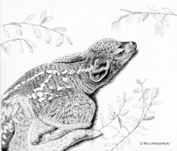
 A fawn lying low to avoid a predator. I added to the original pen and ink. Mary thought it was lacking. Is it an improvement?

The Fawn as I originally drew it in a vignette.

The pen and ink was based off of another fawn picture I took. I love when they are just a couple of days old and they’ll lay down and be still.

I think the vignette would look good in a circular or oval frame. For a square frame I like the second better. Both capture the essence of the new fawn though. (K)
LikeLiked by 2 people
I agree on the framing. Thank you Kerfe!
LikeLiked by 1 person
I like them both, but for me, the softness of the subject conveyed better in the original rendering.
LikeLiked by 2 people
Yes, good point about the softness. Adding the additional detail seems to add some grittiness to the picture, for lack of a better word.
LikeLiked by 1 person
Tim, I just wondered why you chose to have the ears so close. Keeping low as possible, I guess. Both are so sweet.
LikeLiked by 1 person
I did this drawing from a photo I took. The little fawn was pushing itself as close to the ground as it could for fear that I was going to eat it! In my book, it’s always good to get the picture quickly and to leave it alone. Mainly so the doe can get back to her fawn. The doe was close by and huffing her displeasure at the entire situation.
LikeLike
I love them both, but I like the added depth and expanded view of the fawn. It tells me a little bit more of the story.
LikeLiked by 1 person
Mary also thought it needed more information in the picture. I had to stew on it for a while, then decided to add to it.
LikeLike
I like the drawing very much. You’ve captured the gentleness and a sense of alertness. To my eye I think I would like to see more development of the foliage on the left almost so it starts to blend in with the backside of the fawn.
LikeLiked by 2 people
I think you are right Catherine. My original intent was to give the suggestion of foliage, but with the added detail it seems lacking.
LikeLiked by 1 person
Addition of the legs in the second version made the narrative more apparent. I like both drawings, but the second version tells the story better.
LikeLiked by 2 people
Thank for your input Alli. This is reoccurring theme. I think you, Joan and Mary are right about telling the story better. In it’s original form as a stand alone piece, it could leave the viewer wondering what’s going on, or even what it is.
LikeLiked by 1 person
The pen and ink along with adding more of the fawns body/legs definitely helps. Maybe more light shrubbery/ground to give perspective vs. floating on a white page? Really nice work! I love seeing what you’re working on Tim.
LikeLiked by 1 person
It’s always nice to hear from you Terry. I agree with you. I think with the added detail the picture demands more background detail. In it’s original form, I think the suggestion of foliage was okay and floaty was okay. Now the fawn needs a little grounding. Hmmm…not done yet.
LikeLiked by 1 person
Always good to hear from you.
Is an artist ever done or happy? ;). We are our toughest critic. Happy Holidays Livingston family 🎄
LikeLike
I thought they are both beautiful!
LikeLiked by 2 people
Thank you DG!
LikeLike
Both are beautifully rendered Tim. It always helps when the subject is so adorable!! 🙂
LikeLiked by 1 person
Thank you Susan! So true about subject choice. If the subject is good enough you can almost not screw it up.
LikeLiked by 2 people
Beautiful!! 🙂
LikeLiked by 2 people
Thank you Theanne!
LikeLike
Simply beautiful, the main capture for me is in the eyes, the rest is embellishments, When I paint dogs, I’m only concerned with the head. This is a simply fresh and intimate drawing.
LikeLiked by 1 person
Thank you so much Arlene! It’s always a struggle for me to not go all in. It come down to whether I capturing an essence or a moment. I think that it started out as an essence, but I now I’m not sure.
LikeLike
Artists are NEVER happy with their own work. LOL
LikeLiked by 2 people
Yes that’s true. How else would we improve!
LikeLiked by 1 person
I definitely like the darker one with more of the fawn in it better. The positive/negative of the pen and ink comes more into the composition.
LikeLiked by 2 people
Thank you Ruth! I value your opinion. I think it’s not done yet.
LikeLike
Reblogged this on Lisa Mari Egra.
LikeLike
Thank you Lisa! Merry Christmas!
LikeLiked by 1 person
Min glede💕🤗Happy holiday💕Mange klemmer💕
LikeLiked by 1 person
😀
LikeLiked by 1 person
The second version adds more depth and so the fawn really stands out. This contrast makes the drawing pop more than the original did.
LikeLiked by 1 person
Thanks for your input Kay. All these comments made me think of some other additions I want to do to it.
LikeLiked by 1 person
Pingback: Wild Wednesday … Don’t Even Breathe! | THE FORESTER ARTIST